 As
part of a HCI course at Cal Poly, I along with my partner Joe Ryan, sought
out a nonprofit organization that was in need of a website.
As
part of a HCI course at Cal Poly, I along with my partner Joe Ryan, sought
out a nonprofit organization that was in need of a website. As
part of a HCI course at Cal Poly, I along with my partner Joe Ryan, sought
out a nonprofit organization that was in need of a website.
A local high school youth group wanted to attract teens, inform current teens/parents of events, and allow the church community to discover what the group was all about. The believed a website could help reach some of these goals and sought assistance.
We were to identify key stakeholders, user goals, and develop a website concept. Designing for our target users was critical for success.
In our initial site visit we met with our client, the program director, who outlined his goals for the website. We interviewed him to determine what he would define as a successful website.
Stakeholders included:
Of these five stakeholders, we decided to focus on the first two since if we satisfied their needs all the others would be satisfied as well. Of our two design targets, the high school teenager was our primary target and their parents the secondary.
Investigated successful websites that attract teenagers. Selected three and analyzed some of their traits, shown below:
| Seventeen.com
Curves guide the
eye
Links associated with graphics Orange, Blue, Magenta
Colors |
Skateboardermag.com
Fresh Content on the first page Masculine Color Scheme (Black/white w/orange highlights) |
mtv.com
Fresh Content (news/highlights) Gridded Design Colored Sections |
We also sought out other youth group websites however we found that they were often first-generation attempts that failed to meet the level of quality we desired.
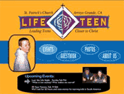
In developing our first concept of what the website's overall design would look like we kept in mind our ethnographic data we collected as well as the design patterns evident in the selected websites mentioned above. We first sketched out our ideas and then refined them into a concept screen-shot
Concept Screen-shot
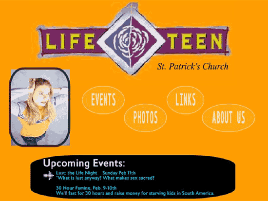
We took our concept image to our second site visit and elicited feedback from both teens and our client the program director. In this case the program director represented the parish and parental options as well.
Teens wanted to see pictures of themselves and their friends on the homepage. The director thought it was important to list the city and state of the church as well as the Life Teen slogan on the home page. Comments were also made that the blue text at the bottom was difficult to read.
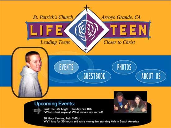
Homepage (Refined)
In our user interviews a common request among teens was to be able to post messages to their friends on a Life Teen guestbook. Their goal of initiating social contact with other teens was very clear and so in the refinement stage we added a guestbook to the website (see below).
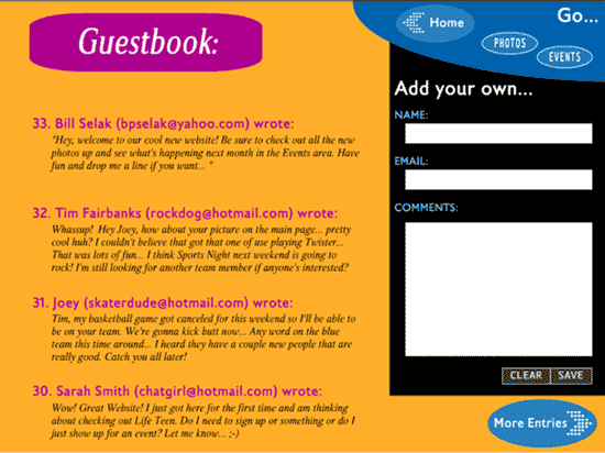
Guestbook (Introduced)
In keeping with the numerous requests for photos of the teens we designed a photo area that was modeled after the scrapbooks that many teens keep. Use of cutouts is popular and integrating quotes also feeds the teenager's goal of being included. We believed it was critical for the website's success for this area to be updated regularly.
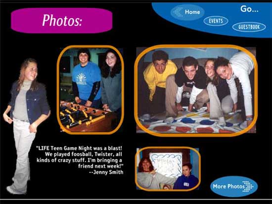
Photo Album (Refined)
In order to improve usability navigation elements
we established some guidelines for the site which remain consistent throughout.
All navigation occurs through oval buttons and blue signifies a navigation
area. In this way, it is clear which buttons will take the user to another
page. Also, when an area has multiple pages of content a button was placed
in the lower right-hand corner and labeled "More BLANK". By pulsing
upon mouse float-over, the buttons afforded clickability.
The final proposal was well received by both the client and the teens. However the funding that was originally committed to the project was no longer available and so no money was left for hosting the website. This unfortunately is to be expected when dealing with nonprofits and while disappointing to us, we understood the situation.
We did an effective job at designing a website that met the goals of both our primary and secondary design target. Our user interviews helped me significantly in empathizing with our design target, however in retrospect it would have been helpful to enumerate these findings into several crisp personas.


